Contact
Project
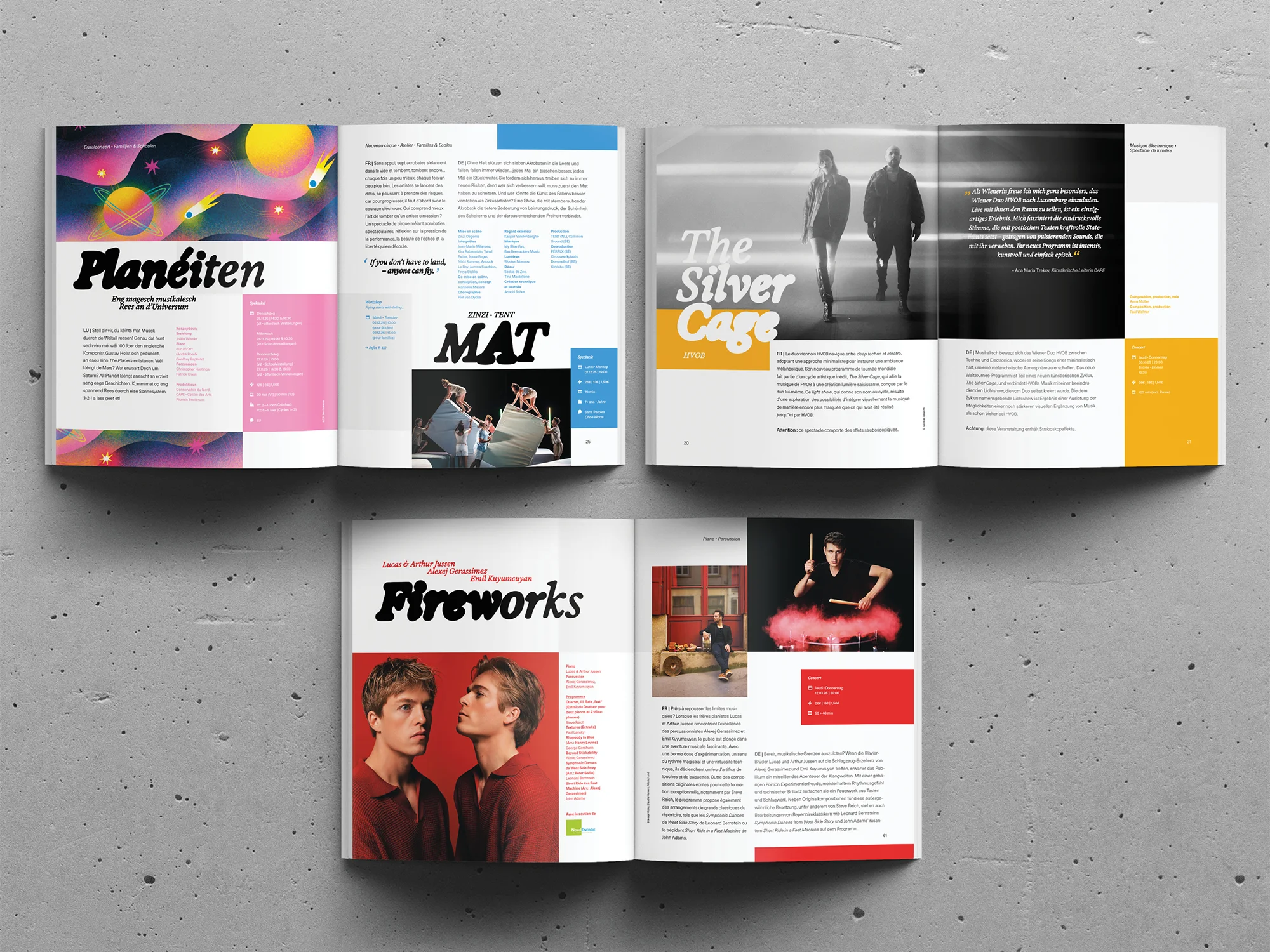
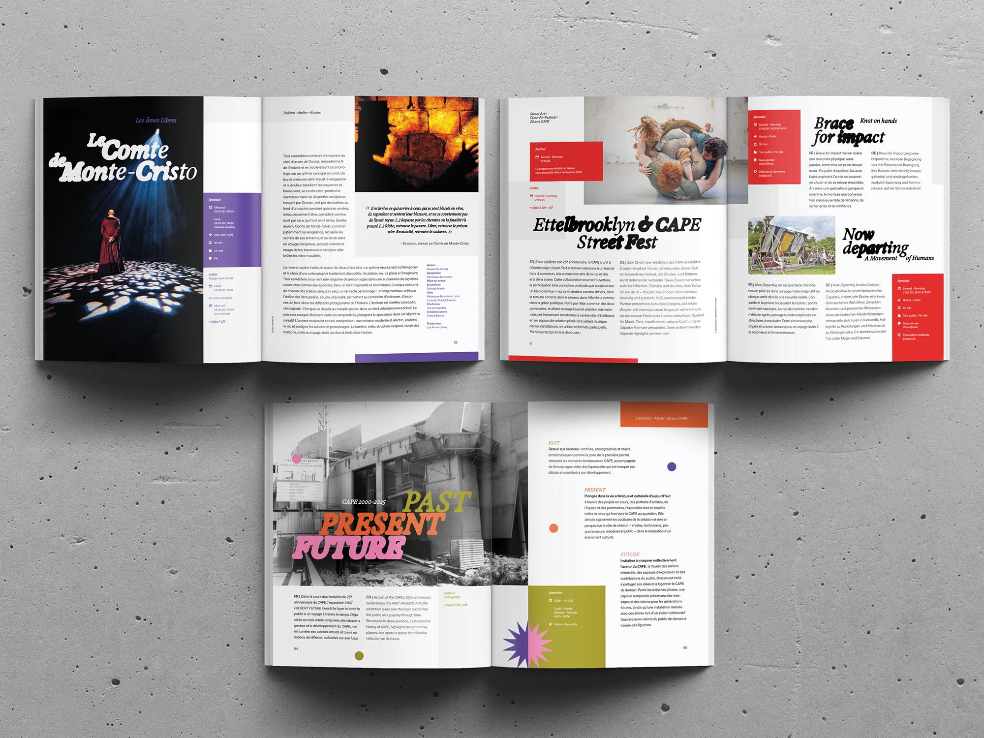
Musical theatre, jazz concerts, dance performances, art exhibitions, and community workshops — all artistic disciplines and forms are welcomed and celebrated at CAPE. Nestled in the city of Ettelbruck, CAPE, or the Centre des Arts Pluriels Ettelbruck, prides itself on showcasing a myriad of artistic disciplines while placing a strong emphasis on community participation.
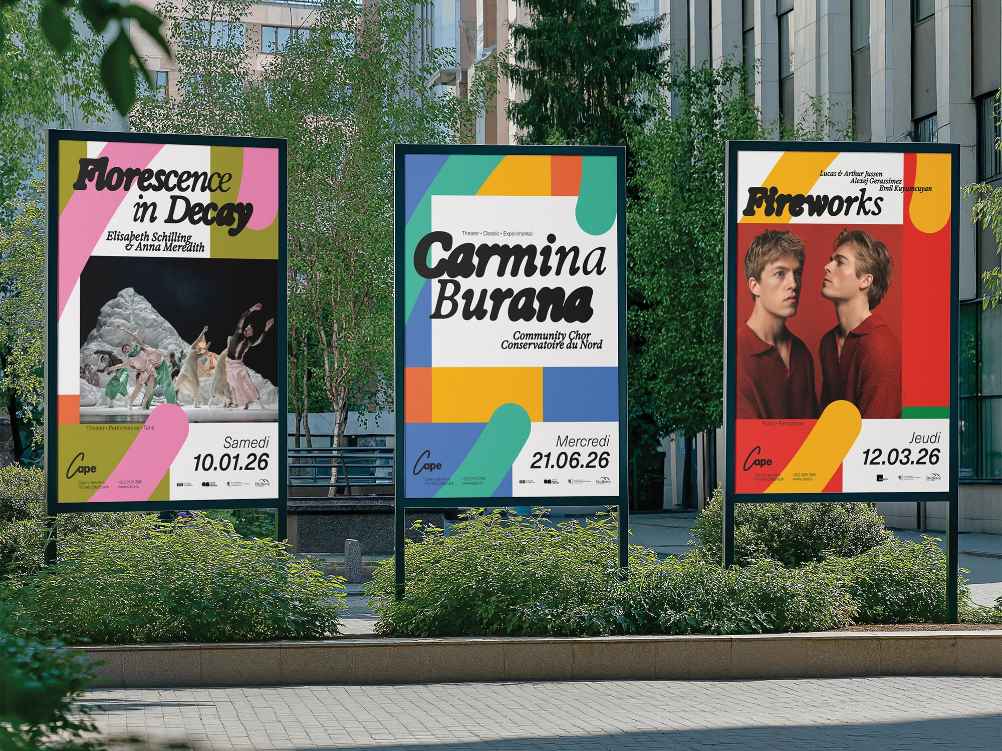
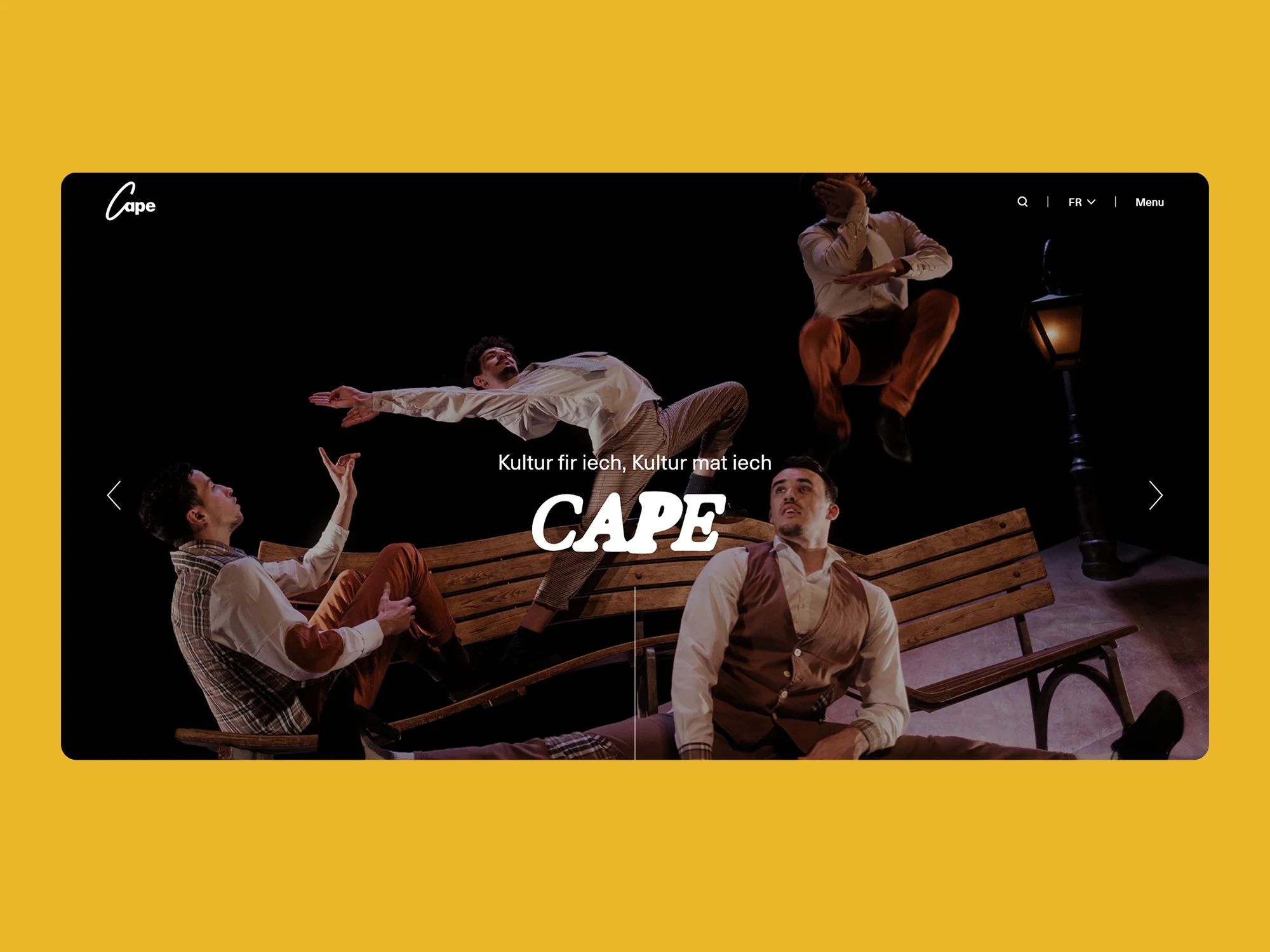
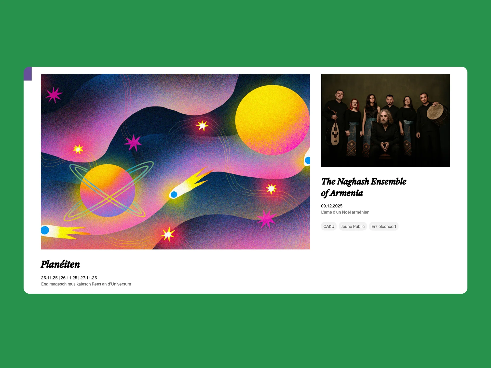
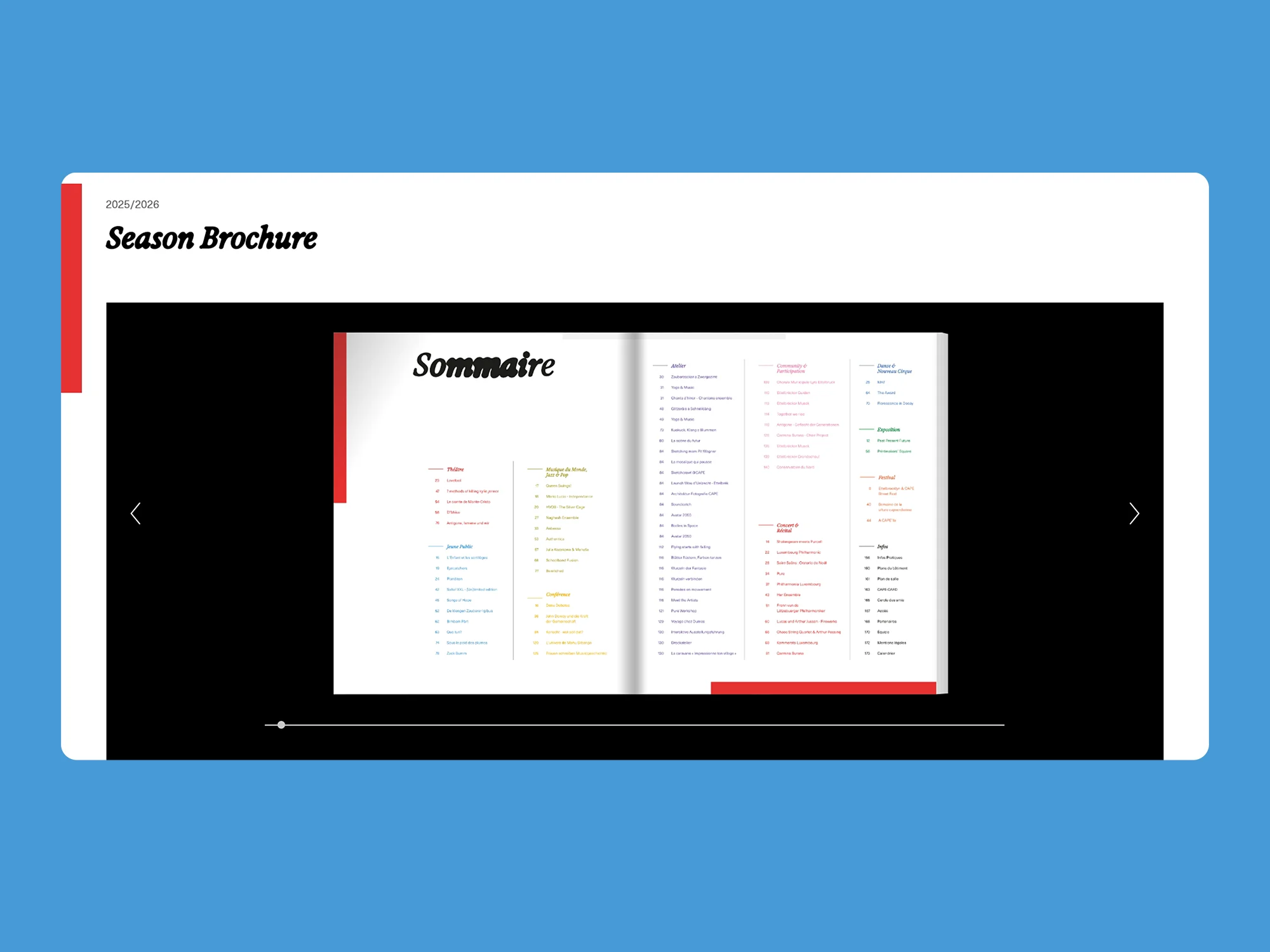
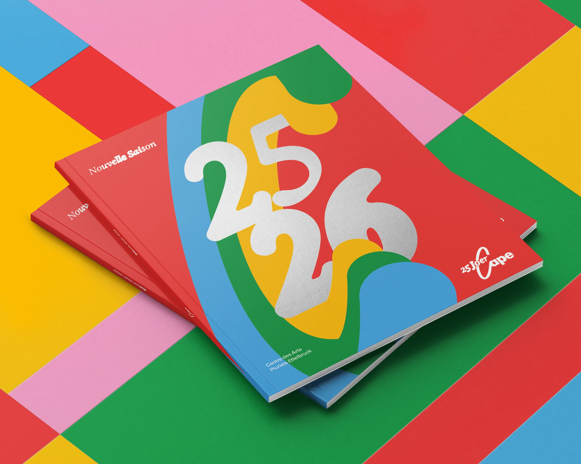
To celebrate CAPE's 25th anniversary, SKIN was tasked with developing a new brand strategy and visual identity that captures the institution's unique personality. We sought to strike a balance between the brand's more sober, institutional side and its playful, artistic spirit. The result is a modular yet highly legible grid system that serves as a stage for bold colour palettes and shape-shifting typography to come to life. The identity is completed by the embracing “C” from the logo, which acts as a distinctive graphic device that frames and envelops a wide variety of layouts and compositions. In doing so, it reflects CAPE's welcoming, inclusive, and participatory ethos.
To celebrate CAPE's 25th anniversary, SKIN was tasked with developing a new brand strategy and visual identity that captures the institution's unique personality. We sought to strike a balance between the brand's more sober, institutional side and its playful, artistic spirit. The result is a modular yet highly legible grid system that serves as a stage for bold colour palettes and shape-shifting typography to come to life. The identity is completed by the embracing “C” from the logo, which acts as a distinctive graphic device that frames and envelops a wide variety of layouts and compositions. In doing so, it reflects CAPE's welcoming, inclusive, and participatory ethos.
Client
CAPE – Centre des Arts Pluriels Ettelbrück
Sector
Arts & Culture